
Font of the month – August 2017
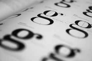
This months font is ‘Lunchtype‘. I immediately saw it and thought ‘toast’! It comes in many different styles, so I’ve shown it here in ’24 expanded medium’ for the headers and ’22 regular’ for the body text:

It has a very ‘clear’ look with the glyphs feeling a little stretched, which is why I probably thought it looks a bit like ‘toast’.
Lunchtype is shown here in the Shoelace theme with a new setting called ‘Seamless’ which aims to reduce the colours and borders on the page. For comparison, please look at ‘Font of the month – July 2017‘. At ‘iMoot2016 MiniMoot‘ I presented on ‘Improving the user interface’ and one of the suggestions that came from that was the concept of ‘feathering’. Feathering is where in an image, boundaries between things are blurred in such a way as to appear to have a smooth transition between the two things. Think of the join between two feathers on a bird, you know they are separate and yet at the same time appear to be one, hence ‘feathering’. It was pitched to me that this would make a theme have a more ‘modern’ and ‘corporate’ look, what do you think?

- Rolls in fridge – 16th June 2026
- Learning never stops – 16th May 2026
- Uniformity – 16th April 2026

