
Moodle LMS Accessibility in 20 Minutes a Day
What is “accessibility”?
If you think that accessibility is the practice of making a Moodle LMS website on the Internet accessible to people such as learners, customers and employees (depending on your case), you are right. However, it is not the ability to give everyone access to your Moodle website but to ensure all people can use the site.
This article is equally applicable to all HTML-based websites such as WordPress, Drupal, not just Moodle LMS.
Why is accessibility important?
It ensures that everyone has equal opportunity no matter what their physical ability or circumstance.
For example, it means making sure that:
- Someone who just has a smartphone can access the same content as a person with a desktop computer.
- A person using a screen magnifier can see what they need to see on your website without having to scan the whole screen.
- A person using a screen reader can have a similar experience to everyone else on your website.
- Search engines like Google, Bing, Baidu and DuckDuckGo can understand the content on your website enough and deliver relevant results to a person’s searches – the same person you probably wish would come and visit your website.
Wait a minute! What do search engines have to do with any of this accessibility stuff? You may not have realized it but they have not yet invented a search engine with eyes and ears. Close your eyes and have someone (or a screen reader) read the content on your website without adding any description of content that is not written in text (images of text do not count). This is what all search engine understands on your page.
According to the World Health Organization (WHO), about 15% of the world’s population, or about 1 billion people, have some form of disability. This means that if you work in an organization with about 1,000 employees, about 150 of them have some form of disability. If you work in a team of just 10 people, at least 1 or 2 members may have some form of disability and you might not even realize it. If you are not doing everything you can to ensure that these people can access all of the content on your public website or intranet site, they may be missing out on your content just like those search engines.
Organizations around the world are being sued for having a website that is not accessible. Many countries, provinces, states and municipalities around the world now require businesses, educational institutions, governments and even non-profit organizations to make their website accessible. The exact requirements vary from one area to the next. For example, many places, like parts of Canada, require conformance with the official WCAG 2.1 Level AA. It is highly recommended that you meet with your organization’s legal council to discuss accessibility requirements and the consequences of ignoring them. You might be surprised at how much trouble one complaint can turn into for your organization. If you do get a complaint, I recommend that you take it seriously and take action quickly to assess and resolve the issue on your website.
Have you ever considered that people with the following disabilities go to your website?
- Blindness, low vision and photosensitivity
- Deafness and hearing loss
- Learning disabilities and cognitive limitations
- Limited movement
- Speech disabilities
- and any combinations of these.
Improving the accessibility of your website will often also make it more usable to users in general.
How can I make my website more accessible? WCAG 2.1!
To make your website more accessible, the first step is to identify areas that could use some improvement.
To help you out, members of an international standards community called the World Wide Web Consortium (W3C) researched and came up with a set of recommendations called the Web Content Accessibility Guidelines (WCAG). It is organized into four main principles (POUR) which state that a website must be:
- Perceivable – Content must be presented to users in a way that they can perceive it, regardless of their abilities and limitations. For example, someone using a screen reader will not be able to read the text in an image or watch a video.
- Operable – This means that a user should be able to navigate your website regardless of whether they have a touch screen, a mouse or can only use the keyboard. Try using your website without a touch screen or mouse.
- Understandable – The content should be readable and understandable. Navigating the website should also be intuitive enough for anyone to operate and not be confusing.
- Robust – This means making your website equally usable regardless of whether the visitor to your website is using a desktop computer, laptop, tablet, smartphone or assistive technologies.
When browsing through each of the success criterions, keep in mind the first 6 words: “The intent of this Success Criterion…”. Most people skip right over this but it is actually the difference between WCAG 1.0 and 2.0. WCAG 1.0 was all about implementing techniques, regardless of whether they made sense or not. If you implemented the technique, you passed the test. As of WCAG 2.x, it is now all about meeting the intent of the criterion, regardless of the technique you use. Don’t just assume that the suggested techniques will be enough. Understand what you are trying to accomplish. If you come up with an alternative undocumented technique which meets the intent, all the power to you.
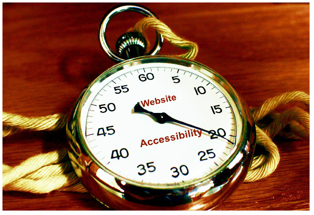
Accessibility in 20 minutes a day
A great way to assess your website is to have your web developer(s) or Quality Assurance (QA) tester(s) use the WCAG 2.1 Level AA Quick Reference to perform an assessment and fix issues. By the way, level AA also includes level A. If you have the budget, by all means, dedicate a team to this. But if you have web developers or QA testers on staff, they are likely very busy and might benefit from the 20 minutes a day method approach.
Accessibility is not just for web developers but also for content creators. Course content, for example, can cause an otherwise WCAG 2.1-compliant webpage to be non-compliant. Content creators should be involved in this exercise as well.
But we are getting ahead of ourselves. Before you can start to fix your website, stop the problem from getting worse. Have your web developers and QA testers learn about accessibility and instruct them to implement the POUR principals of WCAG 2.1 Level AA (or the standard you are required to follow)
For 20 minutes each workday, work your way through your website identifying and fixing accessibility issues. Even fixing a page or two per day can make a big difference over time.
I recommend starting with the most popular pages on your website. If your website is using a theme many CMS and LMS websites do), fix issues with the theme first and then move on to the content. Taking this approach will avoid finding the same issues on every page of your site.
Here is a list of the most common issues you are likely to find:
- HTML errors. Just right-click on a page in your web browser and select View Page Source. Copy everything you see and paste it into the W3C Markup Validation Service tool, an HTML validator. Fix all issues that start with a Warning or Error. Now press F12 in your web browser and then on the Console tab. Fix errors that appear here. Next, click on the Network tab and fix any 403 (Forbidden) and 404 (Not Found) errors.
- Images without alternative text (alt) attributes. All images should include alternative text describing what is in the image. This will be read by screen readers and braille readers. If the image is decorative, your img tag still needs to include the alt=”” attribute which causes the screen reader to skip over and not mention that the image even exists.
- Image of Text. An image of text is a no-no. Why? Because images are not scalable like text and cannot be read by a screen reader like text. Instead, overlay text one the background image. If you have no other choice, at least include some alt text.
- Huge image and video files. Speaking of images, compress down those big megabyte JPG image and MP4 video files. Reduce the resolution to just what you need and save them at 60% to 80% quality. You will be unlikely to even notice the difference but the file size will be substantially less and your pages will load so much faster.
- Popups and Notifications. Do you have a popup that shows up in a completely different part of the screen when you click on a link? Or perhaps a notification/confirmation message appears in the right-side corners of the screen? Here is a little test to help you appreciate what someone with a screen magnifier sees. Make a fist with your hand. Now open it just enough to make a little hole inside your curled fingers. Now look at your screen through the little hole and navigate through your website. This is what it is like to use a screen reader, just seeing a few centimeters or a couple of inches of the screen at a time.
- Not being keyboard accessible. Try navigating your website using just a keyboard (no mouse, trackpad or touch screen). Can you tell where the focus is? If not, you will need to fix your focus indicators (many web developers turn them off!). Can you navigate through menus and popup windows? Does your focus indicator disappear completely or get stuck anywhere?
- Not using form labels. Using a mouse, you should be able to click on the text associated with any form field to give the field focus and toggle checkboxes.
- Non-descriptive hyperlinks. If you have ever had a screen reader read out to you a URL that is longer than google.com, you will quickly understand why web pages should not include the URL address displayed on the page, even if it is clickable. The other big culprit is linked with the word text “here”, as in click here or other similar text. Using a keyboard, tab through all of the links on a page and see how many of them say the same thing. Now imagine that a screen reader is reading the linked text as you press the tab to go from one link to the next. If it sounds like the text would be repetitive and meaningless, this is an opportunity to create meaningful text for your links. This is also good for Search Engine Optimization (SEO).
- Incorrect order of headings. HTML h1 to h6 tags (sometimes just referred to as Heading 1 to Heading 6) are not for size. They are used to help users of screen readers and search engines understand and quickly navigate a web page. They should always be used in a hierarchical order. Example: h1, h2, h3, h3, h1… is good, h1, h3, h2, h4… just because you like the size of the text is not. Fix the order of the heading tags and then fix their size and other font attributes using CSS. Also, make your headings descriptive of the content which follows them. Do not make people guess. When users of screen readers navigate the headings, it will help them find what they are looking for faster.
- Using tables. First and foremost, do not use tables to lay out your page – for so many reasons. For one, your page will not display correctly on different size screens such as mobile devices. Only use tables to display tabular information and make sure to use “th” tags for each column’s headings, as well as for each row’s headings when necessary. The issue of creating accessible tables can get a little complicated but the W3C has a helpful Tables Tutorial to you get started. For layout, HTML has other more modern approaches, often using a combination of div tags and CSS.
- Colour contrast. This is the contrast ratio between the text or glyph and the colour behind it. This is applicable everywhere, even placeholders inside form fields. To test for an acceptable level of contrast, try the Colour Contrast Analyzer. It doubles as a handy colour picker. When you have identified text that has insufficient contrast, plug the colour values into the Accessible Color Generator. It will suggest a close match taking out all of the guesswork.
- Non-accessible documents. Some of the nice things about HTML include that it can be made accessible with relative ease, works with all devices, and is small in file size. It’s not that files like PDFs cannot be made accessible, they just require a lot more effort than simply printing a PDF from an application. Embedding them in a web page complicates navigation, often ending up with multiple scrollbars to contend with.
- Video and audio files. Videos cannot be seen by the visually impaired. Videos and Audio cannot be heard by the hearing impaired. Neither of them can be indexed by search engines. Adding a Closed Caption (CC) will help those who have trouble hearing (or are watching at night), see what is being said in a video. For both video and audio, including a transcript can be extremely helpful. It can be read by a screen reader, can be searched by the user, and can be indexed by a search engine. If you have concerns about it taking up too much space on your page, use the details/summary HTML tags to collapse it or link to a separate page containing a transcript with a link back to the video or audio page. Creating closed captions for videos can be a little tricky but tools like the free version of Subtitle Horse can make it a little easier. Oh, and please, keep your videos and audio short. The optimal length is between 2 to 6 minutes and no more than 12 minutes. After that, unless you are an engaging motivational speaker, you are losing your audience quickly. Also, going back to find a 5-second tidbit of information in a 2-hour (7200 seconds) non-stop video is challenging, even for the most able person.
- Test on a desktop and a smartphone. What looks good on one size screen may not appear as well on a smaller screen. At the very least, reduce the width of your desktop web browser and reload the page. Can you read the text or is it so tiny it could fit through a pinhole? Can you click on form fields and buttons? Are you experiencing issues with double scroll bars? These are a few of the issues you will need to fix.
- Flash is dead. In case you haven’t heard, it’s now been a few years since any of the major web browsers supported Adobe Flash. Even Adobe has renamed their product to Adobe Animate. Today, nobody is seeing your Flash content whether or not it was accessible. You will need to either simply remove it or find another solution.
It sounds like a lot to remember but, after you do it for a while, you will start to get to know the common issues in your website and how to fix them. Best of all, you will stop creating accessibility issues.
Tools and Resources
- WCAG 2.1 Level AA Quick Reference – A checklist to help you learn about the requirements and testing for accessibility guideline compliance.
- W3C Markup Validation Service – For testing HTML.
- Colour Contrast Analyzer – To test the Colour Contrast of foreground and background colour. Can also be used as a double-colour picker too.
- Accessible Color Generator – Find the closest matching colours which would meet the color contrast requirements.
- Subtitle Horse – For creating Closed Captions VTT files for your videos.
- Before and After Demonstration – This site includes examples of common accessibility issues before and after they are fixed.
- WAVE Evaluation Tool (extensions for Chrome, Edge, Firefox) – This automation tool will not be able to identify all of the issues but it will certainly help.
- PDF Accessibility Checker (PAC) – Check your PDF for compliance with WCAG.
- Userway – This is a very easy way to add a widget containing a suite of accessibility tools to your website.
Did you know? Use a spreadsheet to keep track of your issues and progress. As you notice issues throughout your day, copy and paste the URLs from your website into your spreadsheet together with a few words to remind you of the issue. You might even find yourself adding usability improvements ideas to the list.
Don’t forget to put aside 20 minutes in your calendar each morning to work on improving your Moodle LMS website.
See you next month!
Michael Milette
- Debugging SCSS in Moodle LMS – 23rd April 2024
- Moodle LMS Email Deliverability in 2024: Best Practices, Authentication Standards and Troubleshooting – 23rd February 2024
- Terminology for Those New to Moodle LMS – 20th January 2024


Fantastic article Michael! You covered everything!